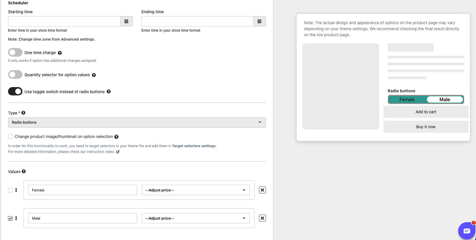
Radio Buttons lets customers choose only one value from a list of available choices. Each option is displayed as a rectangular button, and selecting one automatically deselects the others.
The component can adopt a toggle switch appearance (e.g., an 'ON/OFF' style slider) to enhance the modern look and save vertical space, while still enforcing the single-selection rule.
Note: When the Toggle Switch is enabled, a maximum of two values can be created.
To update the Toggle Switch color and other settings, kindly navigate to Settings >> Display Settings >> Toggle Switch Style and adjust the configurations as required.
Was this article helpful?
That’s Great!
Thank you for your feedback
Sorry! We couldn't be helpful
Thank you for your feedback
Feedback sent
We appreciate your effort and will try to fix the article