The Publish tab in Hulk Form Builder controls how and where your form is displayed on your Shopify storefront. You can present your form embedded directly on a page or as an interactive popup modal triggered by a customizable button.
1. Choosing Form Display Format
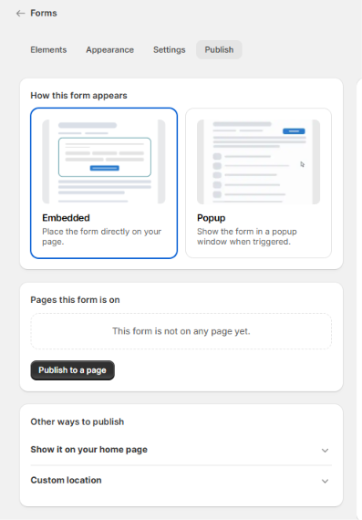
Under Forms → Publish, choose how you want your form to render:
Embedded: Places the form directly within the body layout of your target page.
Popup: Hides the form body on page load and displays it inside an overlay window when triggered by a button.
2. Publishing to Specific Pages
To publish your form to an existing Shopify page:
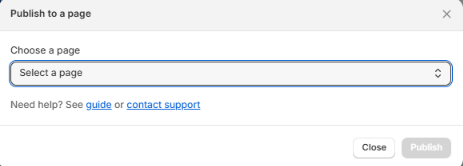
Under the Pages this form is on section, click Publish to a page.
Select your target Shopify store page to embed the form.
3. Alternative Publishing Methods
To add the form to your homepage or custom theme templates, expand the accordion menus under Other ways to publish:
Option A: Show It on Your Home Page
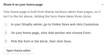
Because Shopify homepages are composed of theme sections rather than standard pages, publish to your homepage using these steps:
In your Shopify admin, go to Online Store → Customize (or click Open theme editor).
On your homepage view, click Add section and choose Form.
Select this form in the block settings and click Save.
Option B: Custom Location (Form ID & Liquid Snippet)
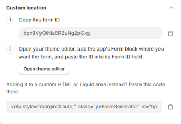
To publish the form in specific theme sections or Liquid code files:
Via Theme Customizer (Form ID Method):
Click the copy icon to copy your unique Form ID (e.g.,
bpn8VyOiNlz0RBuNg2pCxg).Click Open theme editor, add the app's Form block where you want it placed, and paste the ID into its Form ID field.
Via Custom HTML or Liquid:
For custom HTML or Liquid template areas, copy and paste the generated
<div>code snippet directly into your theme code:HTML<div style="margin:0 auto;" class="pxFormGenerator" id="YOUR_FORM_ID"></div>
4. Configuring Popup Form Settings
When Popup is selected, visitors open the form via a trigger button rather than viewing it directly on the page. Customize the trigger button options under Button settings:
Label: Set the display text on the button (default:
Open form).Position: Choose the screen placement (e.g.,
Top Left).Note: Forms set to the exact same position will overlap on screen. Use distinct locations to prevent conflicts.
Padding & Width: Define button padding in pixels (e.g.,
10 px) and specify width as a percentage (e.g.,100%) or fixed pixel value (e.g.,800pxorauto).Trigger with Existing Button: Check this option to attach the popup action to an existing button on your site.
Styling Options: Set Background color, Text color, Border color, Border width (e.g.,
2 px), Border radius (e.g.,999 px), and Text weight (e.g.,Semi-bold).Reset Defaults: Click Reset to default values to revert all button styling to original defaults.
Was this article helpful?
That’s Great!
Thank you for your feedback
Sorry! We couldn't be helpful
Thank you for your feedback
Feedback sent
We appreciate your effort and will try to fix the article