The Password element allows users to securely enter a password within the form. The input is hidden for privacy, and you can set minimum and maximum character limits to control password strength.
Available Options:
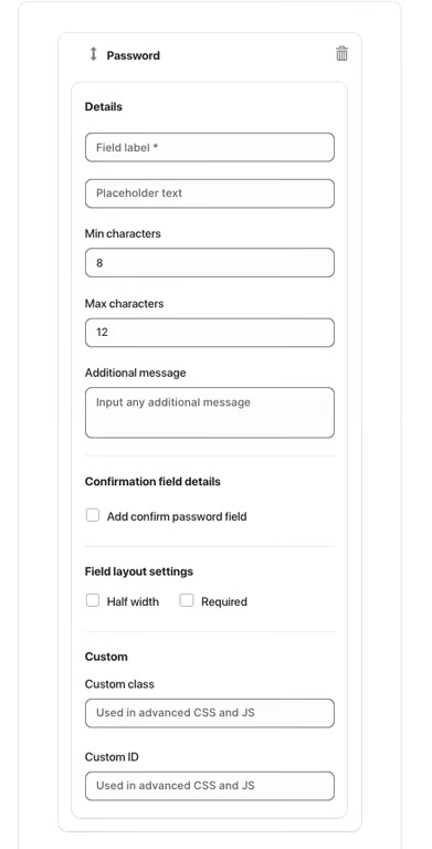
Field label – sets the visible name of the password field.
Placeholder text – displays sample text before the user types.
Min characters – defines the minimum number of characters required (e.g. 8).
Max characters – defines the maximum number of characters allowed (e.g. 12).
Additional message – optional helper text displayed below the field.
Confirmation Field:
Add confirm password field – enables an additional field where users must re-enter their password to confirm it.
Field Layout Settings:
Half width – displays the field in half of the form width.
Required – makes the password field mandatory.
Advanced Settings:
Custom class – used for advanced customization with CSS or JS.
Custom ID – unique identifier used to target the field in custom code.
Was this article helpful?
That’s Great!
Thank you for your feedback
Sorry! We couldn't be helpful
Thank you for your feedback
Feedback sent
We appreciate your effort and will try to fix the article