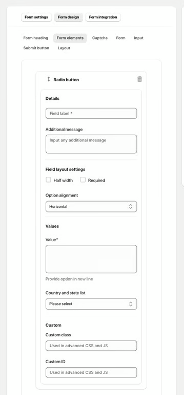
The Radio Button element allows users to select one option from a list of predefined choices. It is ideal for questions with a limited number of mutually exclusive options.
Available Options:
Field label – sets the visible name of the radio button field.
Additional message – optional helper text displayed below the field.
Field Layout Settings:
Half width – displays the field in half of the form width.
Required – makes selection mandatory.
Option alignment – choose how the options are displayed, e.g., horizontal or vertical.
Values:
Value – define each radio option (each option on a new line).
Country and state list – load predefined country or state options automatically.
Advanced Settings:
Custom class – used for advanced styling or JavaScript.
Custom ID – unique identifier for targeting the field with CSS or JS.
Was this article helpful?
That’s Great!
Thank you for your feedback
Sorry! We couldn't be helpful
Thank you for your feedback
Feedback sent
We appreciate your effort and will try to fix the article