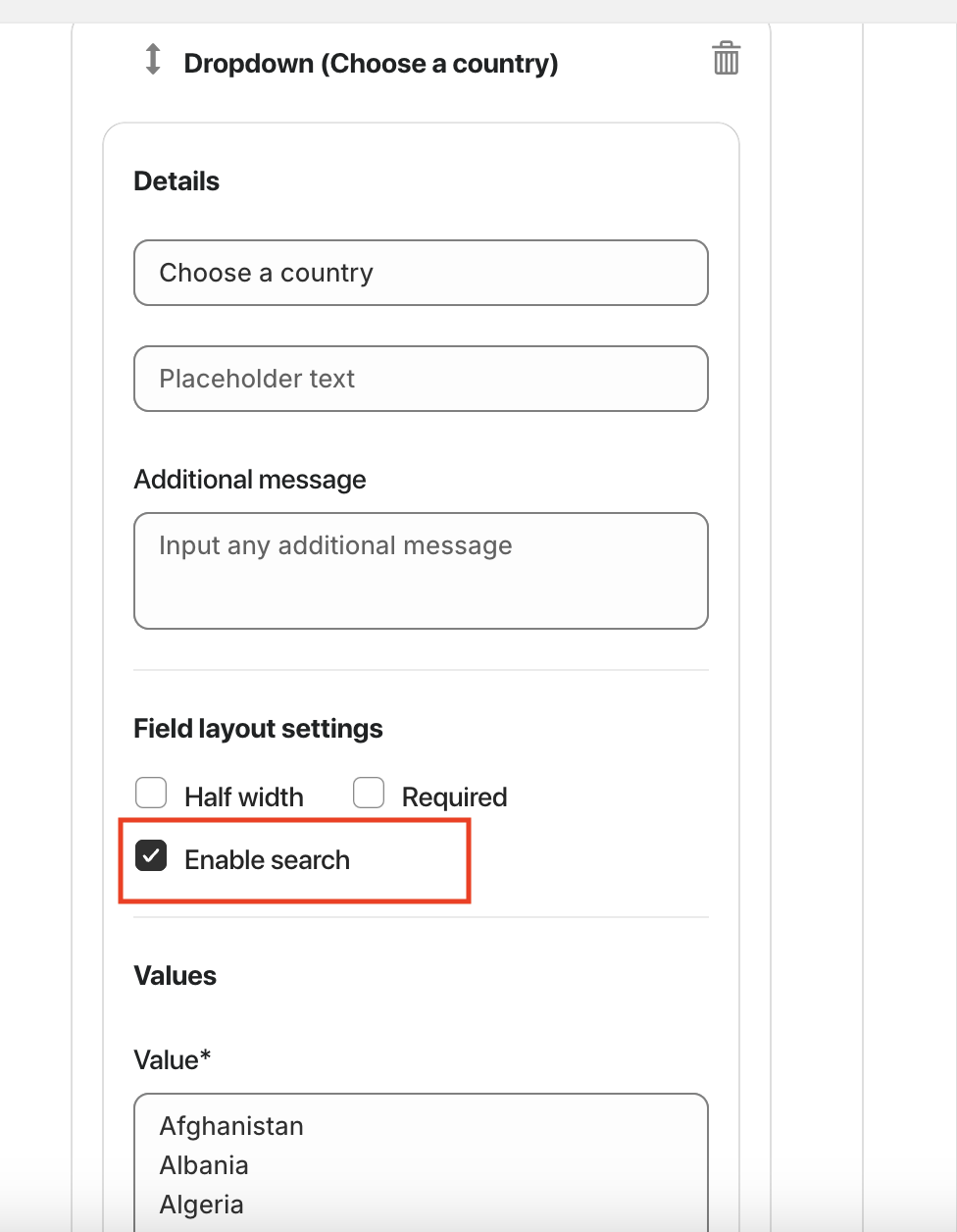
The Dropdown element allows users to select one option from a predefined list of values. It’s ideal for choosing items such as countries, categories, or plan types.
Available Options:
Field label – sets the visible name of the dropdown field.
Placeholder text – displays sample text before any option is selected.
Additional message – optional helper text shown below the field.
Field Layout Settings:
Half width – displays the field in half of the form width.
Required – makes the field mandatory for submission.
Values:
Value – define dropdown options (each option should be placed on a new line).
Country and state list – automatically load predefined country or state options.
Send admin emails based on the selected option – enables conditional email notifications based on user selection.
Allow user to enter other value – gives users the option to manually input a custom value not listed in the dropdown.
Note: To add a new country or state, select that option first.
Advanced Settings:
Custom class – used for advanced styling or custom JavaScript actions.
Custom ID – unique identifier for targeting the field with CSS or JS.

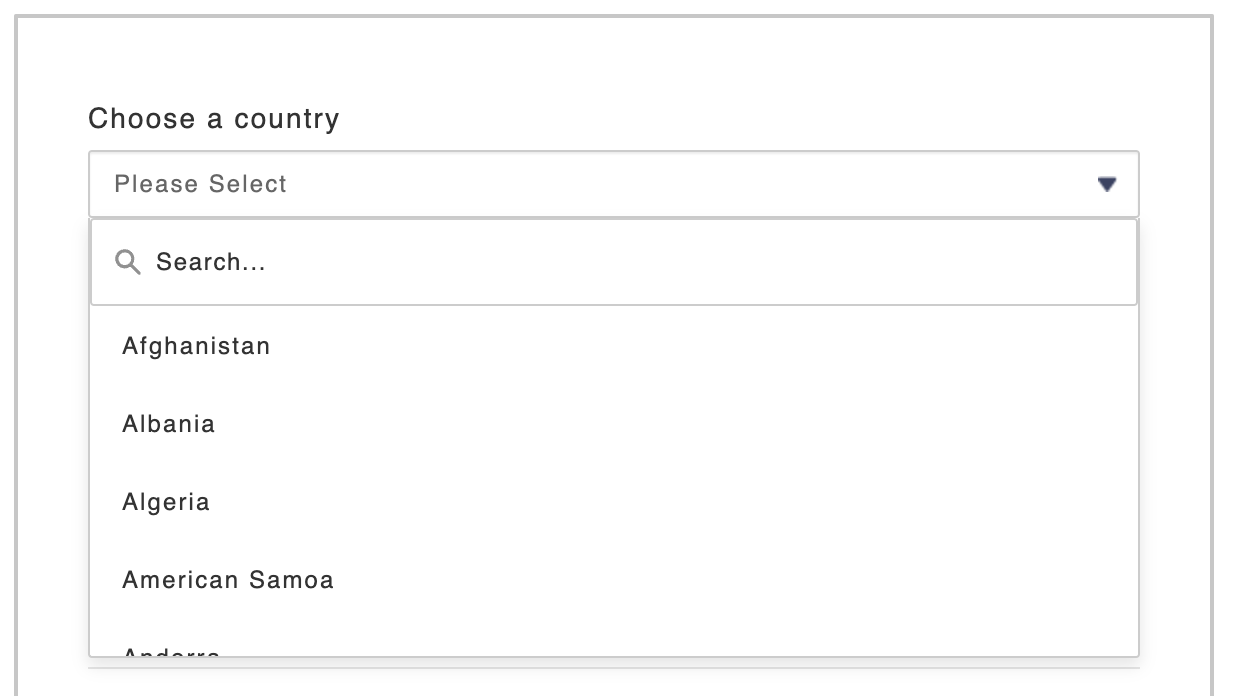
You can also enable the search option for the dropdown element by checking the Enable Search checkbox, allowing users to quickly find and select options from longer lists.
Was this article helpful?
That’s Great!
Thank you for your feedback
Sorry! We couldn't be helpful
Thank you for your feedback
Feedback sent
We appreciate your effort and will try to fix the article